3.7 Sharpness
and Bokeh
In this section we’ll deal with
two commonly cited aspects of image quality for artistic bird photos: sharpness, and bokeh. The former, sharpness, should be a fairly
intuitive concept, though there are some aspects of lens design (and
lens operation) that can potentially lead to variations in sharpness,
and we’ll discuss these first. The issue of bokeh—the quality of having a
smooth, pleasing, and non-distracting background—will be addressed
later in this section.
Sharpness
Assessing the relative sharpness of two images, when they’re shown
side-by-side, is usually pretty easy as long as they’re images of the
same subject or scene. Assessing whether a lens is “sharp”, or “sharp enough”, based on images seen in
isolation can be much more
difficult. One problem is that what really needs to be measured
is not the sharpness of the lens, but the sharpenability of images produced
through the lens under ideal conditions. In other words, if we
were to take some bird photos using a given lens, would we be able to
sharpen the photos enough in Photoshop (or similar software) so as to
produce usable images? Of course, the answer depends on the
intended use of the image: whether for a web page, or for an 8"×10" print, or for a 40-foot
billboard. The larger renderings (i.e., the billboard) will
obviously require more fine details in the image file, in order to
still appear sharp after enlarging.
To illustrate the potential for differences in sharpenability between lenses,
consider the two hawk photos taken below. The left image was
taken with a 1200mm lens (actually, a 600mm lens with a 2× teleconverter attached—but
that’s not really relevant at the moment), while the right image was
taken with a 600mm lens with no teleconverters attached. Both
images are shown at 100% crop,
which means that you’re seeing the native resolution of the camera (in
other words, each pixel on your screen represents exactly one pixel in
the image file; only a tiny portion of each image is shown, however, as
the word “crop” should suggest). Because the left
image was taken using
a 2× TC, it should be much less sharp
than the image on the right—meaning that fewer fine details of the
bird should be visible, and any that are visible should be less
distinct and more “fuzzy”. In this case, since
we haven’t
applied any sharpening yet, the difference in sharpness between these
two images isn’t terribly striking, though the left image may appear a
little “fuzzier” than the image on the right.
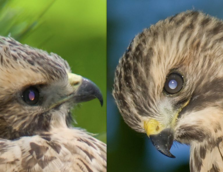
Fig. 3.7.1:
Red-shouldered Hawks (Buteo lineatus) at 100% crop.
Differences in sharpness are difficult to see, without sharpening
in post-process. Left: 1200mm, f/10, 1/200 sec, ISO 640.
Right: 600mm, f/9, 1/250, ISO 320.
To demonstrate
the differences in sharpenability
between these two lenses, we’ve applied an identical amount of
sharpening to both images, via Photoshop, with the results shown in the
figure below. Notice that the image on the right now exhibits
many more fine details than the image on the left. These are
especially visible in the bird’s lore
region (the area between the eye and the beak, where the feathers form
a swirling pattern), in the edge around the eye, and in the texture of
the beak. Because of these differences, we’d say that the image
produced through the second lens is more sharpenable, and lends some
evidence to that lens being fundamentally sharper than the other.
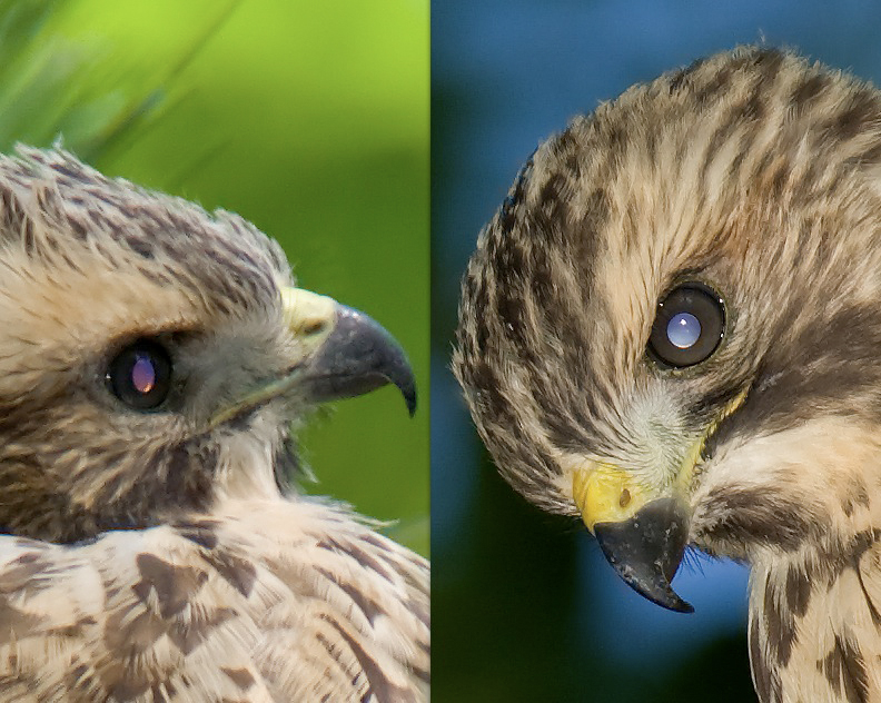
Fig. 3.7.2:
Same images as in the previous figure, but with
identical amounts of sharpening applied in Photoshop.
Now the image on the right appears sharper (as it should,
since the image on the left used a 2× teleconverter).
Examining the
properties of images at 100% crop, as we’ve just done, is often
referred to as pixel peeping,
since we’re looking at the actual pixels of the image file.
Although pixel peeping can reveal differences between lenses, it’s not
always useful for assessing the practical value of a lens. If you
just want to make small prints (8"×10" or thereabouts) of your images
or share them via a web page, it’s probably more useful to assess image
quality at a smaller crop level than 100%.
In the figure below are the same two hawk images as
above, but at 25% crop, and
with some additional sharpening and contrast adjustments made to
each. Because these are 25% crops, each pixel in the images below
corresponds to multiple pixels (16, to be exact) in the original image file—i.e.,
we’ve zoomed out, and are no
longer seeing the individual pixels of the image file. Instead,
Photoshop is averaging small groups of neighboring pixels from the
original image to produce “virtual” pixels to display on your
screen. As a result, it’s much more difficult at this crop level
to see differences in sharpness between the two images (and, by
implication, between the two lenses).
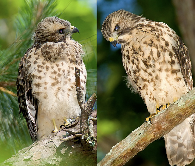
Fig. 3.7.3: The
same hawks, again, but at 25% crop.
Sharpness and contrast were adjusted in both images.
For small prints or web use, the differences in sharpness
between these lenses can probably be ignored.
Which crop level is best for comparing two lenses
depends on how often you’re likely to use each crop level when “publishing” your images (i.e., when making
prints, or when posting
photos on a web page). If you typically photograph large birds
close-up and are using a large-focal-length lens, then you probably
won’t be cropping at all, whereas if your passion is tiny birds like
warblers and hummingbirds, and you’ll be viewing them at a distance or
through a moderate focal-length lens, then you may indeed find yourself
aggressively cropping your images in order to make the bird appear
large in frame. In the
latter case, assessing the sharpness of the lens via “pixel peeping”
makes more sense.
In terms of assessing image sharpness digitally—i.e., on the computer
screen—there are a number of important issues to consider.
First,
most cameras employ an antialiasing
filter which sits over the imaging
sensor, and which will to some degree decrease apparent image
sharpness. For this reason, some sharpening in post-process is
always
recommended for cameras having such a filter, to counteract the slight
blurring effect that the antialiasing filter imposes on the RAW
images. That’s one reason why we introduced the notion of sharpenability above. Second,
if you’re not shooting in RAW (and you probably should
be), then it’s important to realize that your camera may be applying
some sharpening behind the scenes to the JPEG file that it’s
exporting. This is more of an issue when comparing the resolution
of different cameras, but it can become relevant for lens comparisons
if the amount of in-camera sharpening is such that it ends of masking
slight differences in lens sharpness.
Another very important issue is that apparent
sharpness tends to increase
with smaller apertures (i.e.,
larger f-numbers)—at least,
up to a point. As we mentioned in section 3.1,
the depth of field (DOF)
increases with decreasing
aperture. Thus, for smaller apertures (like f/11), a wider margin in front of
the bird and behind the bird will appear to be in focus than at smaller
apertures (like f/4).
To the extent that autofocus doesn’t always perfectly set the focal
point exactly on the bird, a larger depth of field can help to mask
these slight focusing errors, since a slightly mis-focused bird that is
wholly contained within a large DOF will still look mostly in
focus. This is illustrated in the figure below.
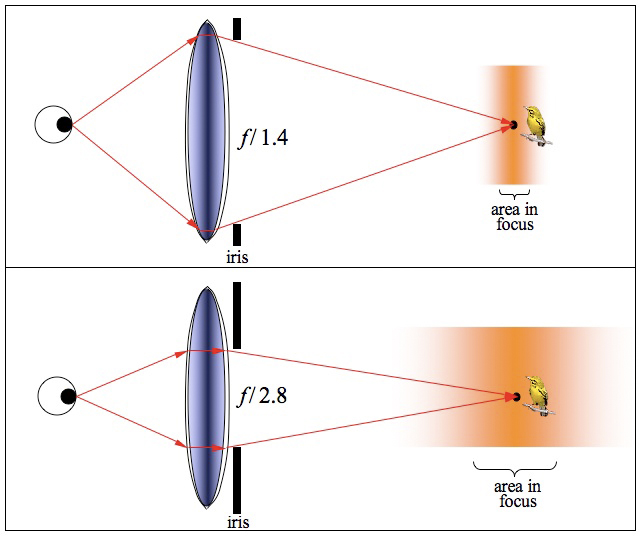
Fig. 3.7.4:
Depth-of-field changes with aperture, and can
mask focusing errors. Top: the lens is focused slightly in front
of the bird. Because the aperture is wide, the depth of field is
shallow,
and the bird will probably look fuzzy. Bottom: a smaller aperture
produces a wider DOF, and now the bird should appear less fuzzy.
In the top part of the figure (above), the lens’ iris is opened to its
widest setting (f/1.4 in this
case), corresponding to the shallowest depth of field. In this
example, the lens is slightly front-focused—notice that the black dot
(what we’ll informally call the “focus point”) to which the red arrows
converge is slightly in front of the bird. The orange gradient
surrounding this black dot represents the depth of field; the fact that
the orange fades out gradually represents the fact that the “in-focusness” of the points around the focus
point also gradually
fades out at increasing distances from the focus point.
In the bottom part of the figure, we’ve stopped down the lens (meaning that
we’ve reduced the aperture) by closing the iris a bit (to f/2.8), resulting in a wider depth
of field. Now the orange gradient (representing points that
appear more-or-less in focus) extends further to either side (forward
and backward) of the focus point. Since the bird is now more
completely contained within the darkest part of the orange gradient, it
should appear much more in-focus than in the top part of the
figure. Thus, by decreasing the aperture, we’ve reduced the
effect of the focusing error (i.e., fact that the black dot wasn’t
positioned exactly on the bird).
The reason depth-of-field increases with smaller
apertures (and also with distance to subject) is explained in Box
3.7.1, below. Feel free to skip the box if you’re not interested
in understanding why DOF works the way it does. Just note one
additional thing: at some point, reducing the aperture can actually decrease sharpness rather than
increase it, via diffraction.
Diffraction limits typically don’t become extreme until the
aperture drops below f/16 or f/22 on most lens/camera
combinations, so it’s usually not an issue for practical bird
photography.
Box 3.7.1: Why DOF
increases with smaller apertures
|
The
reason depth-of-field increases as the aperture is stopped down can be
understood in terms of simple geometry. Note that in the figure
above, as the aperture was reduced, the cone of light converging at the
eyeball became narrower. Imagine what would happen if the eyeball
was moved slightly closer to the lens: it would intrude into that cone
of light, and what would be perceived wouldn’t be a single point, but a
slice of the cone—i.e., a circle. Thus, positioning the focal plane (i.e., the imaging
sensor) too close to the lens would cause light rays from any point on
the bird to scatter over a circular area, rather than focusing to a
point.
Now, if instead of the sensor being too close to the
lens, the bird was slightly in front of the focus point, a similar
thing would happen: the cone of light coming from any point on the bird
would be focused to a point just behind
the sensor plane, and once again we’ve got a point on the bird giving
rise to a circle of
illumination (rather than a point)
on the sensor. If the circle is very small—say, about the size
of a photosite (pixel) on the
sensor—then the bird will still seem to be in focus. For
circles that are slightly larger than this (i.e., if the bird is a bit
further from the true focus point), there will be some “smearing”
of
color around each pixel, but at small crop ratios it will still look
fairly well-focused. For yet larger deviations from the focus
point, the bird will start to look progressively fuzzier in the image
formed on the sensor plane.
As noted above, however, reducing the aperture
causes the light cone to become narrower, which means that the rate at
which the circles grow in size, as the bird moves away from the focus
point, decreases. As a result, larger focus errors become more
tolerable at smaller apertures, with the criterion of “tolerable”
being
effectively defined by the photosite size.
You may still have one lingering doubt,
however—namely, how is it that less
light (resulting from a smaller aperture) can produce more information (in terms of the
level of detail visible in the image of the bird)? The answer to
this conundrum has two parts. First, whenever you reduce the
aperture, you invariably end up compensating for the reduced light
admission by changing the shutter speed (or, alternatively, the ISO
setting), so as to maintain a properly exposed image. Thus,
rather than “throwing
away”
light, stopping down effectively just redistributes
light into a narrower
cone persisting over a longer time interval. Finally, in terms of
the apparent increase in “bird
information content”
(i.e., level of
detail), this is due to these narrower cones resulting in greater
concentration of light into informative pixels and less light
contributing to reduced contrast via light scatter.
|
There’s another good reason to “stop down” a lens to
a smaller aperture. It turns out that most lenses are not their
sharpest when shooting wide open
(i.e., at maximum aperture), and this isn’t simply an artifact of the
depth-of-field effect discussed above. In the figure below are
three images of a Brown-headed Cowbird (Molothrus ater), the two leftmost
images taken at f/5.6 (the
maximum aperture of the lens that was used), and the rightmost image
taken at f/8. Since the
focus point was directly on the bird’s cheek or neck area in all three
photos, we can largely ignore issues of DOF. As you can see, fine
feather details appear more distinct in the cheek/neck area of the
image taken at f/8. For
this particular lens (the Sigma 800mm f/5.6
prime lens), I’ve found that maximum sharpness occurs at about f/11, which is two full stops down
from maximum aperture (f/5.6).
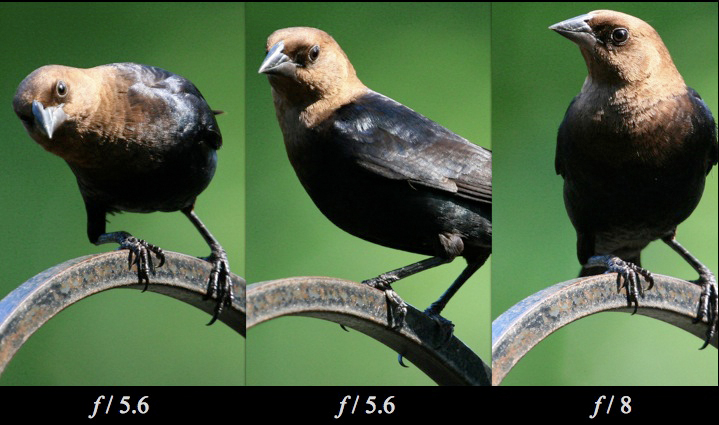
Fig. 3.7.5:
Many lenses get sharper when you stop them down.
The left and middle images were shot wide open (f/5.6), while the
rightmost image was shot one stop down (f/8). In addition to the
greater DOF, the rightmost image appears sharper, even at the
focal point, than the other two images.
The
conventional wisdom is that while most lenses need to be stopped down a
bit to achieve maximal sharpness, not all lenses need to be stopped
down by the same amount.
Thus, a higher-quality lens might require less stopping-down than a
lower-quality lens, to achieve maximal sharpness, and that would allow
you to get the sharpest images without sacrificing as much light by
stopping down. Keep this in mind as you read lens reviews.
Good reviewers will typically test a lens at various apertures.
As a general rule, cheaper lenses are cheaper for a reason, and a lack
of sharpness—particularly sharpness at maximum aperture—is often
one of those reasons. Whereas my Sigma 800mm f/5.6 lens typically needs to be
stopped down to f/11 (2 full
stops) for maximal sharpness, my Canon 600 + 1.4× TC (effective: 840mm, f/5.6) combination is generally at
its best at f/7.1—only 2/3
of a stop down from wide open. In this case I’d chalk that up to
the R&D advantages of the larger company (Canon).
Bokeh
A much more subtle differentiator between birding lenses is what is
known as the bokeh.
Bokeh is a Japanese term used to describe the background of an
image. Today, many people prefer images in which the main subject
stands out well from the background. Photographers thus try to
get photos in which the background is smooth and indistinct, with few
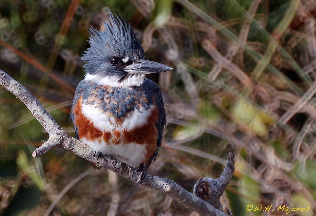
details to distract the eye from the main subject. An example of poor bokeh is given by the Belted
Kingfisher (Megaceryle alcyon)
photo shown below.
Fig.
3.7.6:
Good Bird, Bad Bokeh.
The distracting background patterns in this image were
caused by a large DOF and by the fact that the lens was a
catadioptric mirror lens with a “black hole” in the center
(causing the doughnut shapes). 1600mm, f/12.
The background in the image above
contains a lot of distracting elements. In this case, the bird
was perched in front of a bush with many bare twigs showing.
Because the lens was a fixed-aperture lens, I had no choice but to
shoot at f/12, which resulted
in a large depth-of-field that wasn’t shallow enough to render the bush
totally out-of-focus. Another problem evident in this photo is
the lens’ tendency to make doughnut-shaped patterns in the background,
which some people find distracting. In this case, both problems
(the large depth-of-field and the doughnut patterns) were caused by my
use of a mirror lens—actually,
a Maksutov-style astronomical
telescope. Mirror lenses are often criticized for the poor bokeh
they impart to their images.
Even expensive lenses can produce distracting
background artifacts, however. In the Louisiana Waterthrush (Seiurus motacilla) image below, you
can see that the background also contains many round or polygonal
shapes which can be somewhat distracting. This image was chosen
for inclusion in a nature calendar, so apparently the bokeh was good
enough for the calendar’s editor. But the fact that the lens, an
$8000 (US) prime lens made by Canon, produced background artifacts
shows that no lens is perfect in this regard.
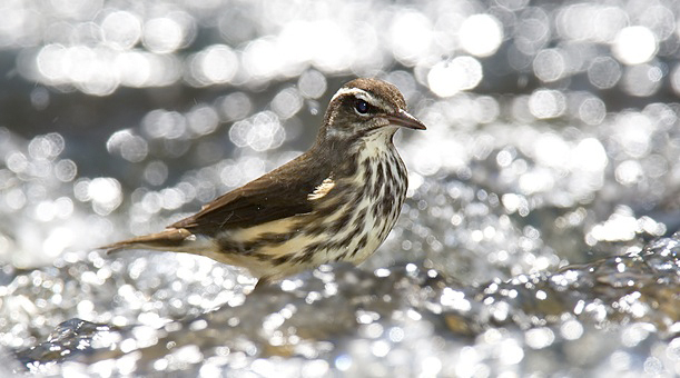
Fig. 3.7.7:
Even expensive lenses can cause background artifacts.
Background circles / octagons are caused by the lens’ iris, which
controls the aperture. This lens (Canon 600mm f/4L IS) just
happens to have an 8-bladed iris; hence the octagons.
In this case, you can see that
many of the background shapes are roughly octagonal. This is a result
of the shape of the iris
(diaphragm) used to adjust the aperture in this lens. Since this
lens has an 8-bladed iris, any background shapes that appear in an
image are likely to have an octagonal aspect. Lenses with more
blades in their iris will tend to produce rounder background
shapes. Also, some lenses feature an iris with rounded blades,
which can result in a smoother bokeh.
In practice, poor bokeh can almost always be fixed
in post-process (i.e., in Photoshop), if you’re willing to spend the
time doing so. In the figure below, you can see that I’ve
replaced the background with a green gradient. Personally, I
think I prefer the unmodified image (on the left), but this at least
demonstrates that image backgrounds can be replaced wholesale, if you
don’t like what’s there.
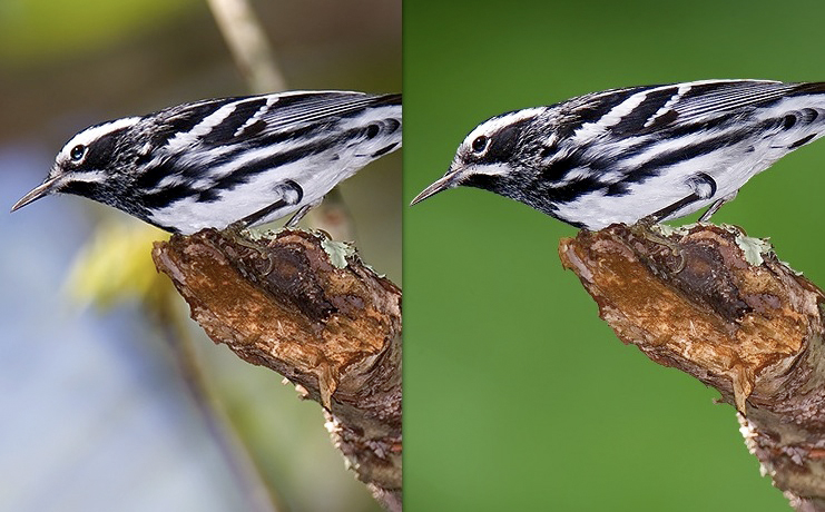
Fig. 3.7.8:
Black-and-white Warbler (Mniotilta varia).
Left: the original image. Right: after replacing the background.
Another example is given
below. In this next figure, I’ve replaced the background behind
this Palm Warbler (Dendroica palmarum)
with an irregular green pattern, rather than a simple gradient or solid
color. In this case, the background was made by taking an
out-of-focus photo of a sunlit forest edge, and then merging it with
the original bird image (a painstaking process, unfortunately).
Although the resulting image looks a bit unreal, it’s certainly more
striking than the original (not shown).
Fig. 3.7.9:
Palm warbler (Dendroica palmarum).
Composite image: an out-of-focus background was
merged into the original bird photo, which had a
relatively poor bokeh.
In the next image (below), I’ve
again replaced the background with an out-of-focus image of a
forest/sky scene. In this case, though the background was
artificially added to the image, it at least illustrates something
important about bokehs in general—namely, that a good bokeh isn’t
necessarily entirely devoid of detail. In my opinion, a good
bokeh has significantly less
detail than the foreground, so that the viewer’s eye is drawn first to
the bird, but still has some
interesting patterns for the eye to contemplate after it has finished
contemplating the foreground.
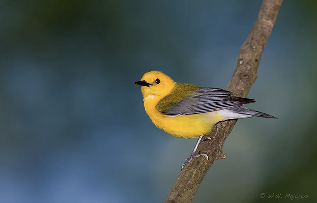
Fig. 3.7.10:
Prothonotary warbler (Protonotaria citrea).
Another composite image.
Unlike the two previous images,
the next image contains the natural background captured in the original
photo. Again, you can see that the background has much less
detail than the foreground, but does have some crude, indistinct
patterning to give the eye something to contemplate after it’s done
absorbing all of the detail in the bird.
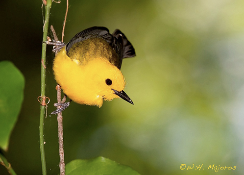
Fig. 3.7.11:
Another Prothonotary Warbler.
This image retains its original background.
Finally, the image below again
shows a “natural” background (ie., not “Photoshopped”). The light
areas of the background are simple and avoid distracting the eye from
the subject (the bird). The branches and pine needles aren’t
rendered totally out of focus, as the traditional recipe for good bokeh
would call for, but in this case I think they add just the right amount
of detail to show some of the character of the bird’s natural habitat.
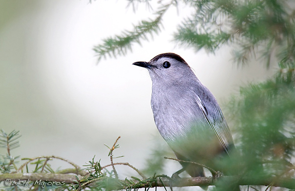
Fig. 3.7.12:
Gray Catbird (Dumetella carolinensis).
This image retains its original background.
In summary, while sharpness and bokeh are certainly
important aspects of lens quality, if your lens isn’t the sharpest or
the smoothest-bokeh-producing
lens available, it’s not the end of the world. In terms of
sharpness, you may just need to stop down your lens a bit more than you
would with a more expensive lens, and compensate for the lost light
with a slower shutter speed or higher ISO setting. If, during
post-processing, you find that sharpening the image still doesn’t
produce an acceptably sharp image of the bird, you may just have to
settle for a smaller crop ratio,
in which the bird appears a bit smaller in the final image. In
terms of bokeh, if your lens doesn’t unfailingly deliver that “smooth,
buttery background” that lens connoiseurs talk
affectionately about,
then you might just need to work harder to find birds in less-cluttered
environs (so the backgrounds will tend to be smoother even through your
particular lens) or to get more creative in post-processing.
Smoothing and the replacing of backgrounds in Photoshop is discussed in
great detail in Part III of this book.
|